Wingham Akoostik
Brand Refresh
Client background
This is a well established and popular music event which takes place annually in Wingham.
Brief
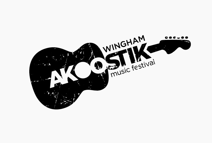
The existing logo was well recognised, having been used over many years for this event. We were asked to strengthen and simplify it without losing the essence of what was already established.
Solution
The guitar shape was strengthened and simplified through the removal of a pattern that sat within the previous version. The first letter “o” was made solid to more clearly represent the hole in the guitar. The handle shape was changed to acknowledge the increase in electric guitar music in the modern festival. A subtle distressed texture was included to add some grunge and to make the logo feel more organic to reflect the rural environment.
Application
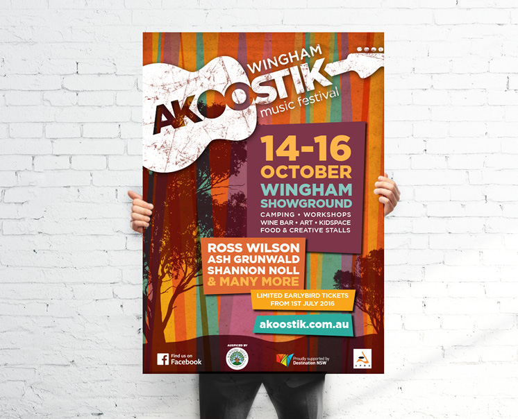
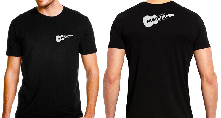
The simplification process was important as the event is themed differently each year and the logo had to be recognisable first and foremost. We applied the new logo to posters and advertising and introduced a colourful, festive striped theme to represent the strings of a guitar. The stronger and simplified logo had a great sense of “pop” in this environment.


