The Edible Forest
Branding
![]()
Client background
This client sells home grown products to the local community. They are all about permaculture – sustainability and self-sufficiency.
Brief
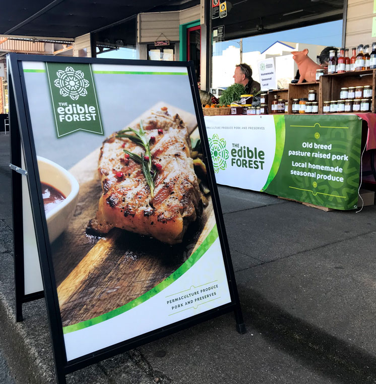
As sellers of home grown produce, home-made preserves and original species pork, it was important to portray freshness and authenticity as well as a sense of organic earthiness.
Solution
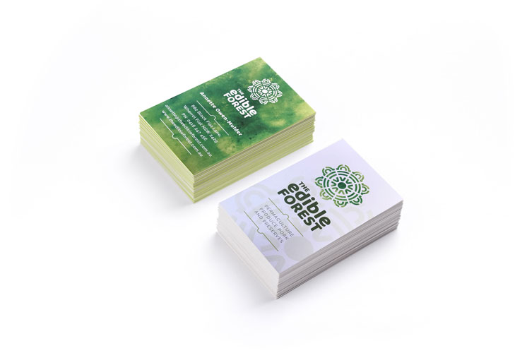
The icon is based upon a permaculture planting scheme and aims to be warm and friendly through the use of curves. The font is also very curvaceous to help give the brand an approachable feel. The use of shades of green reflects their environmental stance and the use of a water-colour texture helps to add interest and an organic feel.
Application
The brand has so far been rolled out into business cards, signage and food labels.