Shoe Guru
Client background
My client had been located in a suburban northern Sydney shopping centre for many years as a franchisee for large, well-known shoe store brand and had made the decision to re-establish under his own brand.
Brief
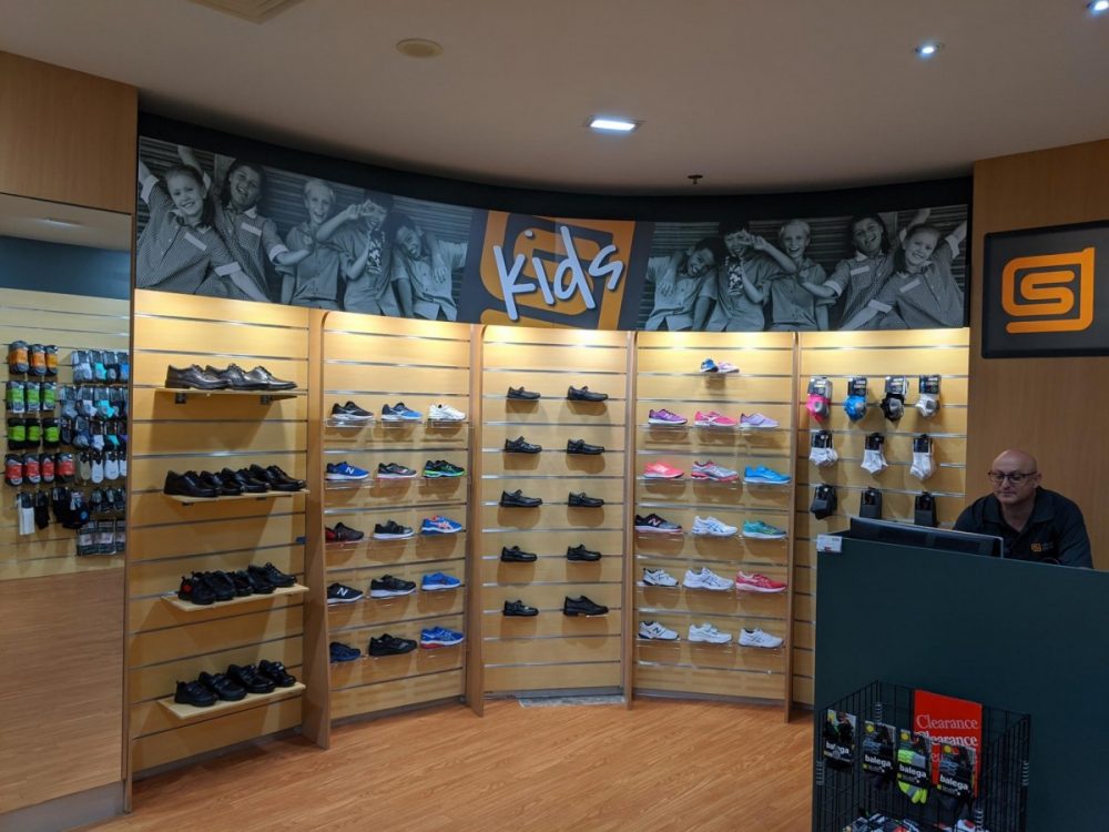
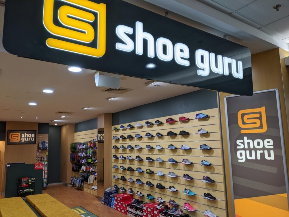
He had many loyal customers who he wanted to re-assure would still receive the same personal service they had become accustomed to. So the new brand had to feel strong, steady and to some degree, corporate to stand up to the strength of the previous franchise whilst still conveying some warmth and friendliness to the local customers. It also had to appeal to a broad range of customers from athletes, to older clientele and bushwalkers to mothers with school kids.
Solution
The colour palette was designed with the Australian bush in mind. A large number of customers are into bushwalking and the store itself is in an area surrounded by bush, so it felt appropriate. These colours also exude warmth while the symbol and font are both very curvy, creating a friendly, approachable brand. Bold, simple graphics create a logo that is easily read and recognised, an important factor in any brand but particularly important with older clientele.