Red Earth Wholefoods


Client background
My client had purchased an existing business and wanted to breathe new life into it without alienating the existing customer base.
Brief
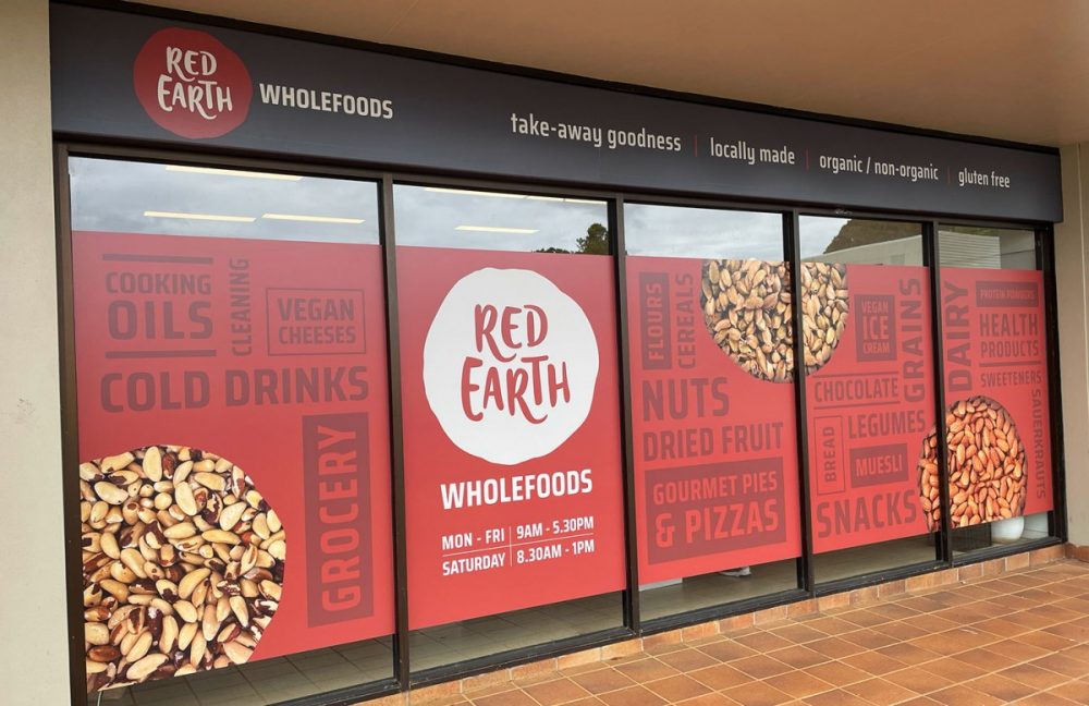
To evoke a feeling of an organic, healthy and welcoming store whilst also creating a strong impact in a busy shopping mall environment.
Solution
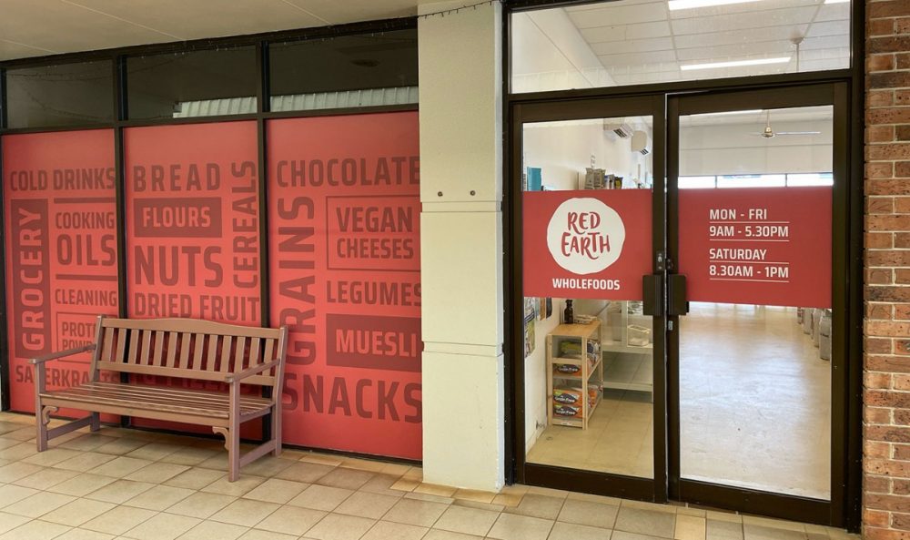
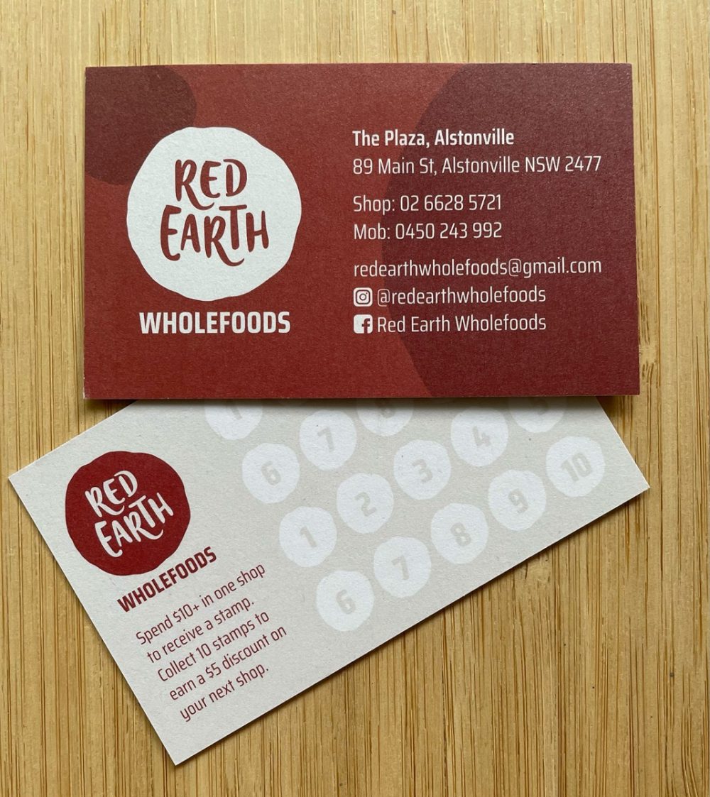
The name lent itself to the use of the burnt red colour which really helped to achieve a strong impact amongst a sea of cream and beige. The brand needed to be warm, friendly and organic to suit the products being sold in-store, so a hand-drawn circle was used to house the name. The font also has a hand drawn feel. A clean, bold contemporary font was used to contrast with this and a typographical wallpaper of key products was created to both tell a story of what to expect from the store whilst also creating impact.

