
Ra Fruit Packaging
Packaging Design
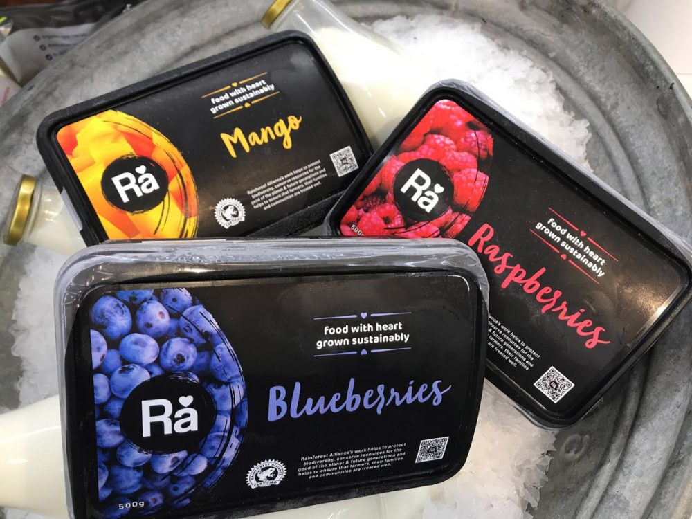
Brief
The client had selected a plastic tub that they wished to use to set them apart from other products on the shelf and also to provide the consumer with a vessel that could be re-used or recycled. The packaging had to portray quality, reflect the seriousness of their business in relation to producing a sustainable product and work with their existing brand. It also had to look appetising.
Solution
An all over black look was chosen to offset the rich colours of the fruit and tie in with the existing black and white Ra brand. This also gave the product a sense of quality and credibility whilst creating a strong impression on store shelves. A brushstroke script font was selected to connect with the Ra logo circle and add warmth to the packaging.