Nature’s Decor Branding

Client background
The client did not have a brand in place as he had previously been part of a franchise group. He had been able to continue using their graphics but was ready to build on his strong local business with branding of his own.
Brief
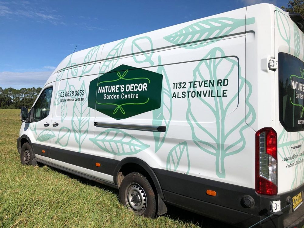
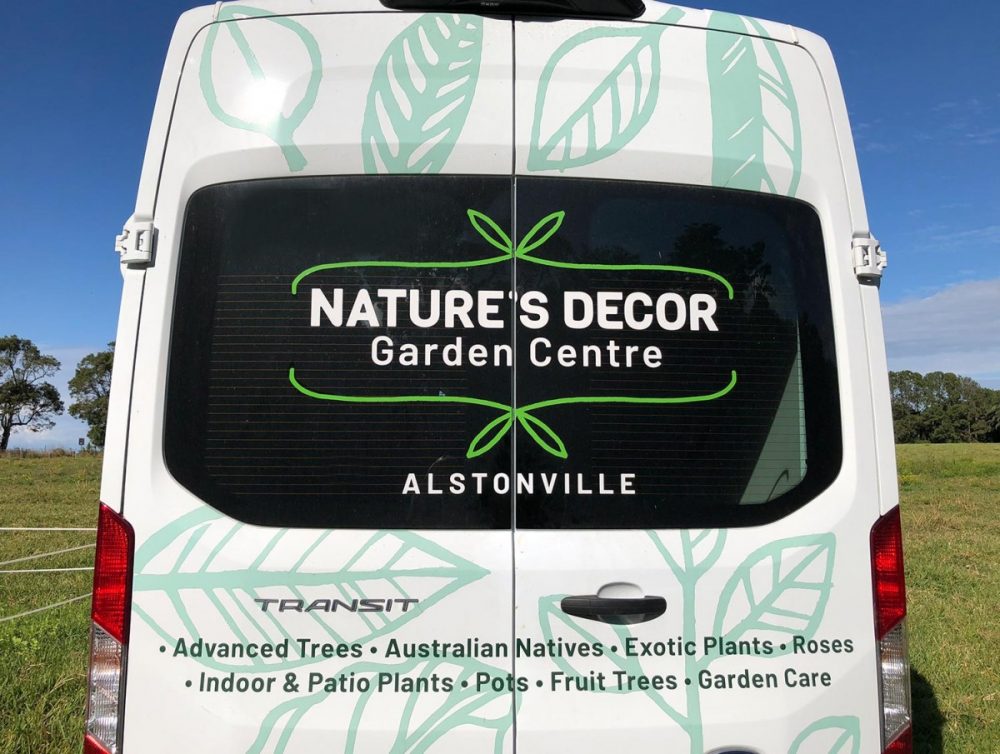
My initial brief was to create graphics for a van that would catch the eye. As there was no brand in place, we extended the brief to consider an overall branding solution as the first step which was then applied to the van.
Solution
The logo was kept as a simple and strong typographical solution. It is housed on a shape which resembles a plant tag to help it pop out from a background. The background graphics are hand-drawn leaves to create an organic feel, scaled up to a large size for maximum impact. Three different shades of green were used to reflect the variations found in a garden setting.

