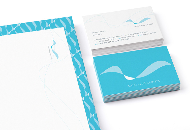
Morpheus Cruises
Branding
Client background
Morpheus Cruises is a family business that has been operating since 2004. They strive to provide the ultimate Sydney Harbour experience for any event; weddings, corporate functions or more private, intimate occasions.
Brief
The client required a brand that captured the feel of cruising one of the world’s most spectacular harbours. It had to attract a customer base ranging from corporates to couples planning their wedding, achieving a balance of elegance and sophistication.
Solution
The symbol is a sweeping curve which evokes waves splashing against the side of a boat, a flag captured by a breeze or a bird flying overhead. It’s all about the sense of freedom that being out on the water can give. Its clean, simple lines and contemporary font make it a strong corporate logo whilst its elegant shapes work well in a wedding environment.
Application
The brand has been used on stationery, brochures, vessel signage and a website.