MidCoast Council
New Local Government Brand
Client background
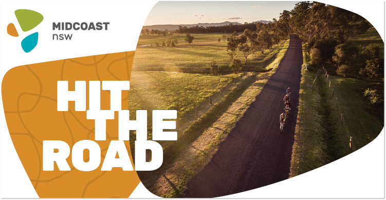
The former Local Government areas of Gloucester, Greater Taree and Great Lakes were merged into the new MidCoast Council in 2016. A new brand was required.
Brief
Brief was ‘What and who is MidCoast’. The new identity was to capture the people and place. Beautiful natural assets, strong community who chooses their lifestyle and who are future focused.
Solution
The logo icon is an organic stylisation of the three regions that make up the new Council. The negative space in between the shapes form a subtle abstract “M”. They also represent the three indigenous tribes united by one language. The drawing style is deliberately naive to suggest indigenous culture.
The colours used represent those found within nature in the region. The warm ochre represents earth, rock, bark and dry vegetation; the turquoise represents the vibrant waters of the lakes; the olive represents the sunlit bush and rolling hills of the pasturelands.
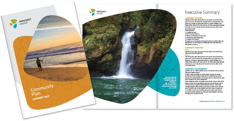
Graphic elements. A hand-drawn scribbly pattern has been developed to add texture and interest. It carries through the shapes used in the logo and is inspired by forms found in nature, such as the complex river delta system, reflections on the water or patterns in the bark. The naive shapes in the logo are combined and used to house imagery, type and the pattern and simply to add blocks of colour to layouts.
Fonts. Rubik is the primary logo font, also used for headlines. Nunito Sans is proposed for heavier text use. Clean, contemporary, web friendly and with a large family of weights, both these fonts help to create a modern, legible brand.
Application
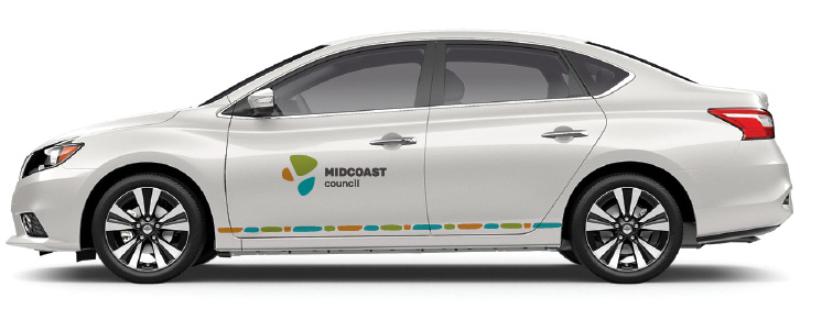
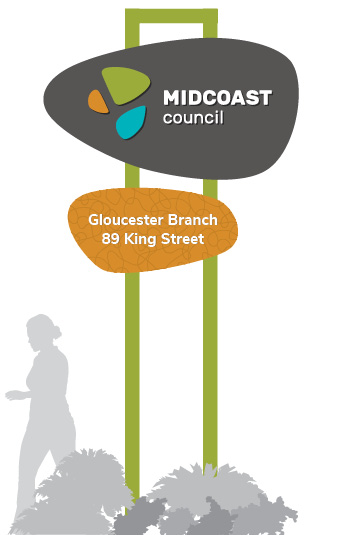
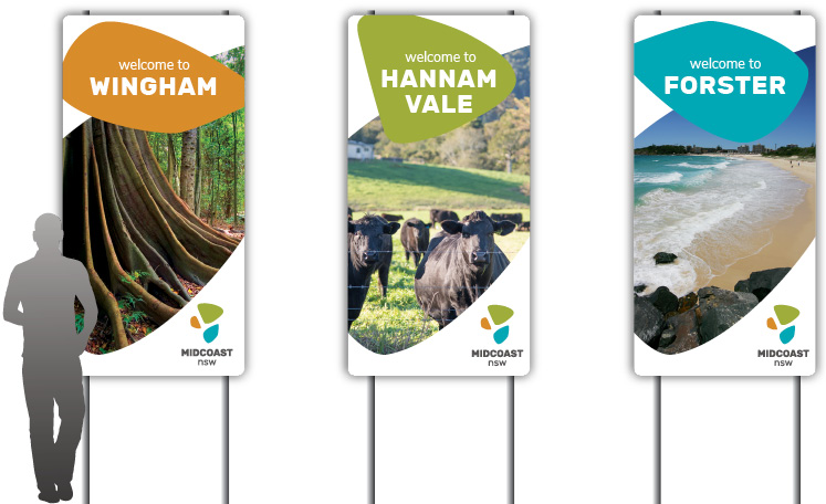
The roll out of the brand will continue as new items are required. To-date, we have produced the brand guidelines and all associated templates for suppliers and internal use.