Machins Sawmill
Branding
Client background
Machins Sawmill has a long history in the region. They have been through periods of mixed fortunes, but remain a strong local business a significant employer in the community.
Brief
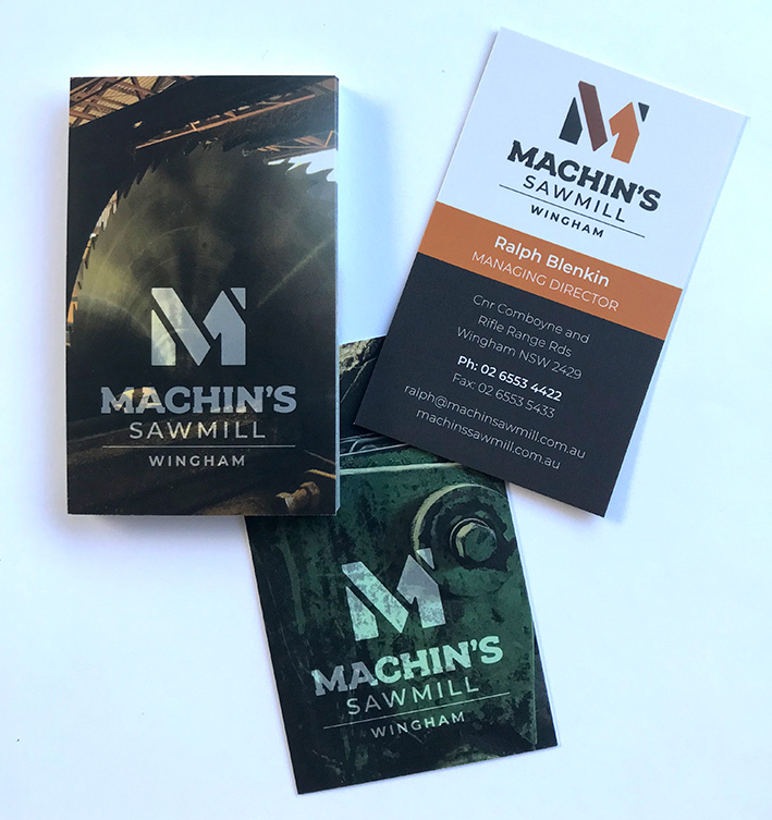
The client wanted to combine a sense of their long history with a strong, modern brand that would appeal to both their traditional client base as well as bespoke builders and carpenters.
Solution
The “M” icon is sliced to emphasise the strong angles of the letter and suggest the slicing of the timber. The range of earthy tones relate to the product and give it a sense of having been around for a long time. The font choice has an historical feel but has been tweaked to also feel contemporary. Overall the brand’s strength lies in its simplicity and bold weight.
Application
The brand has so far been rolled out into business cards, signage and a website.